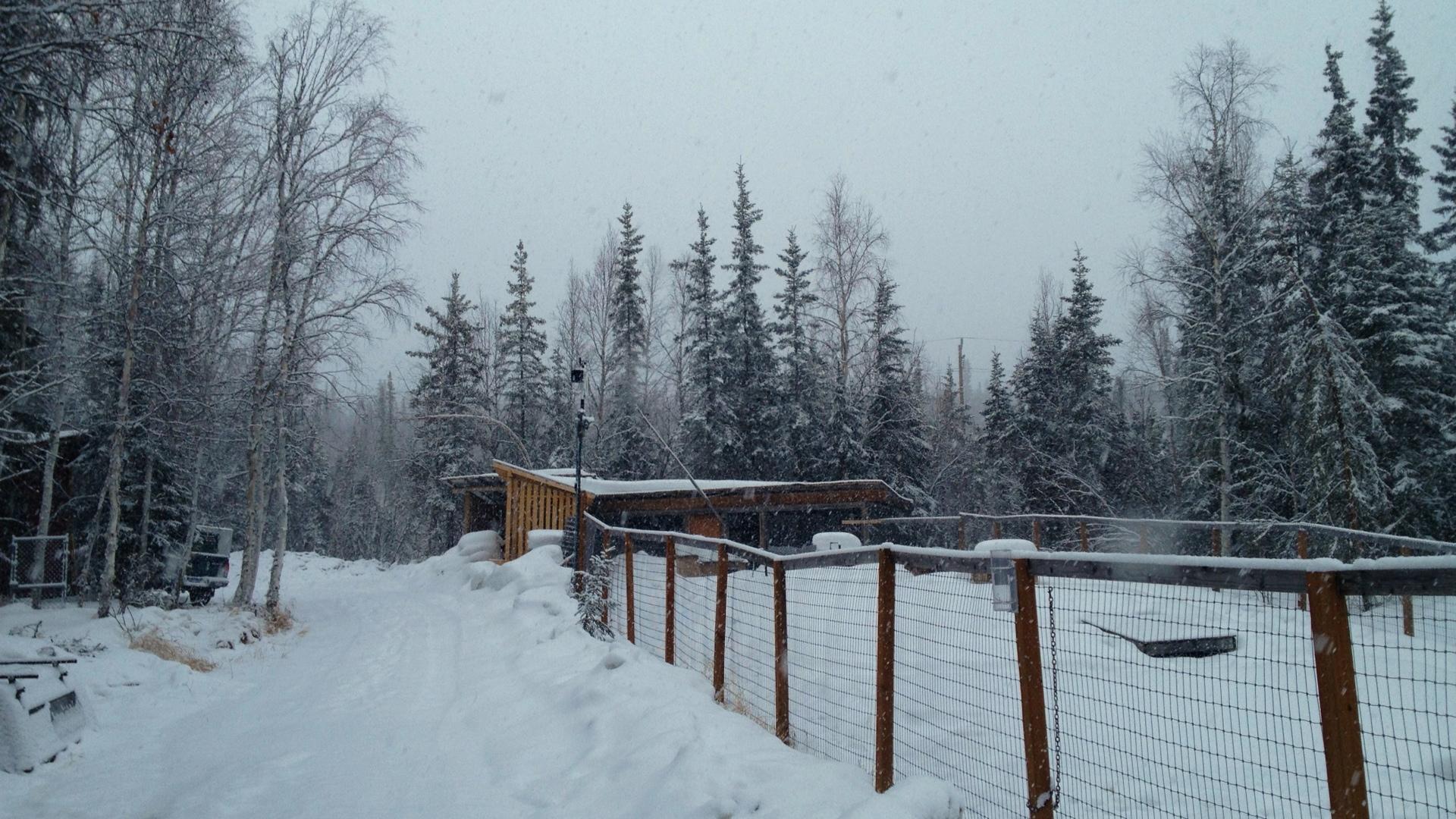
I spent most of October and November building a dog barn for the dogs. Our two newest dogs (Lennier and Monte) don’t have sufficient winter coats to be outside when it’s colder than ‒15°F. A dog barn is a heated space with large, comfortable, locking dog boxes inside. The dogs sleep inside at night and are pretty much in the house with us when we’re home, but when we’re at work or out in town, the dogs can go into the barn to stay warm on cold days.
You can view the photos of the construction on my photolog
Along with the dog boxes we’ve got a monitoring and control system in the barn:
- An Arduino board that monitors the temperature (DS18B20 sensor) and humidity (SHT15) in the barn and controls an electric heater through a Power Tail II.
- A BeagleBone Black board running Linux which reads the data from the Arduino board and inserts it into a database, and can change the set temperature that the Arduino uses to turn the heater on and off (typically we leave this set at 30°F, which means the heater comes on at 28 and goes off at 32°F).
- An old Linksys WRT-54G router (running DD-WRT) which connect to the wireless network in the house and connects to BeagleBone setup via Ethernet.
The system allows us to monitor the conditions inside the barn in real-time, and to change the temperature. It is a little less robust than the bi-metallic thermostat we were using initially, but as long as the Arduino has power, it is able to control the heat even if the BeagleBone or wireless router were to fail, and is far more accurate. It’s also a lot easier to keep track of how long the heater is on if we’re turning it on and off with our monitoring system.
Thursday we got an opportunity to see what happens when all the dogs are in there at ‒15°F. They were put into their boxes around 10 AM, and went outside at 3:30 PM. The windows were closed.
Here’s a series of plots showing what happened (PDF version)
The top plot shows the temperature in the barn. As expected, the temperature varies from 28°F, when the heater comes on, to a bit above 32°F when the heater goes off. There are obvious spikes in the plot when the heater comes on and rapidly warms the building. Interestingly, once the dogs were settled into the barn, the heater didn’t come on because the dogs were keeping the barn warm themselves. The temperature gradually rose while they were in there.
The next plot is the relative humidity. In addition to heating the barn, the dogs were filling it with moisture. It’s clear that we will need to deal with all that moisture in the future. We plan on experimenting with a home-built heat recovery ventilator (HRV) that is based on alternating sheets of Coroplast plastic. The idea is that warm air from inside travels through one set of layers to the outside, cold air from outside passes through the other set of layers and is heated on it’s way in by the exiting warm air. Until that’s done, our options are to leave the two windows cracked to allow the moisture to escape (with some of the warm air, of course) or to use a dehumidifier.
The bar chart shows the number of minutes the power was on for the interval shown. Before the dogs went into the barn the heater was coming on for about 15 minutes, then was off for 60 minutes before coming back on again. As the temperature cools outside, the interval when the heater is off decreases. Again, this plot shows the heater stopped coming on once the dogs were in the barn.
The bottom plot is the outside temperature.
So far the barn is a great addition to the property, and the dogs really seem to like it, charging into the barn and into their boxes when it’s cold outside. I’m looking forward to experimenting with the HRV and seeing what happens under similar conditions but with the windows slighly open, or when the outside temperatures are much colder.
How will I do?
My last blog post compared the time for the men who ran both the 2012 Gold Discovery Run and the Equinox Marathon in order to give me an idea of what sort of Equinox finish time I can expect. Here, I’ll do the same thing for the 2012 Santa Claus Half Marathon.
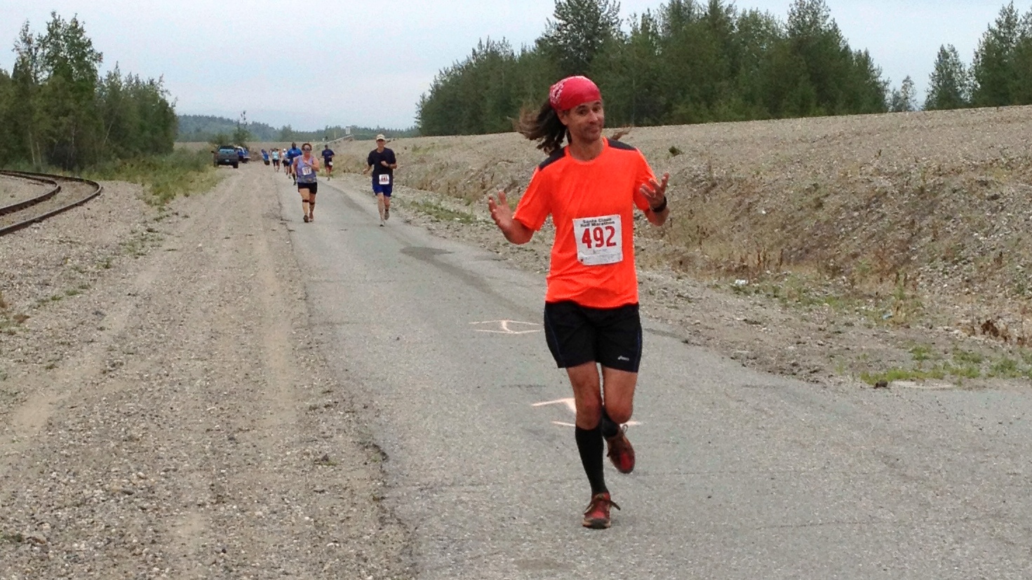
Yesterday I ran the half marathon, finishing in 1:53:08, which is an average pace of 8.63 / 8:38 minutes per mile. I’m recovering from a mild calf strain, so I ran the race very conservatively until I felt like I could trust my legs.
I converted the SportAlaska PDF files the same way as before, and read the data in from the CSV files. Looking at the data, there are a few outliers in this comparison as well. In addition to being ouside of most of the points, they are also times that aren’t close to my expected pace, so are less relevant for predicting my own Equinox finish. Here’s the code to remove them, and perform the linear regression:
combined <- combined[!(combined$sc_pace > 11.0 | combined$eq_pace > 14.5),]
model <- lm(eq_pace ~ sc_pace, data=combined)
summary(model)

Call:
lm(formula = eq_pace ~ sc_pace, data = combined)

Residuals:
     Min       1Q   Median       3Q      Max
-1.08263 -0.39018  0.02476  0.30194  1.27824

Coefficients:
            Estimate Std. Error t value Pr(>|t|)
(Intercept) -1.11209    0.61948  -1.795   0.0793 .
sc_pace      1.44310    0.07174  20.115   <2e-16 ***
---
Signif. codes:  0 ‘***’ 0.001 ‘**’ 0.01 ‘*’ 0.05 ‘.’ 0.1 ‘ ’ 1

Residual standard error: 0.5692 on 45 degrees of freedom
Multiple R-squared: 0.8999,     Adjusted R-squared: 0.8977
F-statistic: 404.6 on 1 and 45 DF,  p-value: < 2.2e-16
There were fewer male runners in 2012 that ran both Santa Claus and Equinox, but we get similar regression statistics. The model and coefficient are significant, and the variation in Santa Claus pace times explains just under 90% of the variation in Equinox times. That’s pretty good.
Here’s a plot of the results:
As before, the blue line shows the model relationship, and the grey area surrounding it shows the 95% confidence interval around that line. This interval represents the range over which 95% of the expected values should appear. The red line is the 1:1 line. As you’d expect for a race twice as long, all the Equinox pace times are significantly slower than for Santa Claus.
There were fewer similar runners in this data set:
| Runner | DOB | Santa Claus | Equinox Time | Equinox Pace |
|---|---|---|---|---|
| John Scherzer | 1972 | 8:17 | 4:49 | 11:01 |
| Greg Newby | 1965 | 8:30 | 5:03 | 11:33 |
| Trent Hubbard | 1972 | 8:31 | 4:48 | 11:00 |
This analysis predicts that I should be able to finish Equinox in just under five hours, which is pretty close to what I found when using Gold Discovery times in my last post. The model predicts a pace of 11:20 and an Equinox finish time of four hours and 57 minutes, and these results are within the range of the three similar runners listed above. Since I was running conservatively in the half marathon, and will probably try to do the same for Equinox, five hours seems like a good goal to shoot for.

Gold Discovery Run, 2013
This spring I ran the Beat Beethoven 5K and had such a good time that I decided to give running another try. I’d tried adding running to my usual exercise routines in the past, but knee problems always sidelined me after a couple months. It’s been three months of slow increases in mileage using a marathon training plan by Hal Higdon, and so far so good.
My goal for this year, beyond staying healthy, is to participate in the 51st running of the Equinox Marathon here in Fairbanks.
One of the challenges for a beginning runner is how pace yourself during a race and how to know what your body can handle. Since Beat Beethoven I've run in the Lulu’s 10K, the Midnight Sun Run (another 10K), and last weekend I ran the 16.5 mile Gold Discovery Run from Cleary Summit down to Silver Gulch Brewery. I completed the race in two hours and twenty-nine minutes, at a pace of 9:02 minutes per mile. Based on this performance, I should be able to estimate my finish time and pace for Equinox by comparing the times for runners that participated in the 2012 Gold Discovery and Equinox.
The first challenge is extracting the data from the PDF files SportAlaska publishes after the race. I found that opening the PDF result files, selecting all the text on each page, and pasting it into a text file is the best way to preserve the formatting of each line. Then I process it through a Python function that extracts the bits I want:
import re
def parse_sportalaska(line):
    """ lines appear to contain:
        place, bib, name, town (sometimes missing), state (sometimes missing),
        birth_year, age_class, class_place, finish_time, off_win, pace,
        points (often missing) """
    fields = line.split()
    place = int(fields.pop(0))
    bib = int(fields.pop(0))
    name = fields.pop(0)
    while True:
        n = fields.pop(0)
        name = '{} {}'.format(name, n)
        if re.search('^[A-Z.-]+$', n):
            break
    pre_birth_year = []
    pre_birth_year.append(fields.pop(0))
    while True:
        try:
            f = fields.pop(0)
        except:
            print("Warning: couldn't parse: '{0}'".format(line.strip()))
            break
        else:
            if re.search('^[0-9]{4}$', f):
                birth_year = int(f)
                break
            else:
                pre_birth_year.append(f)
    if re.search('^[A-Z]{2}$', pre_birth_year[-1]):
        state = pre_birth_year[-1]
        town = ' '.join(pre_birth_year[:-1])
    else:
        state = None
        town = None
    try:
        (age_class, class_place, finish_time, off_win, pace) = fields[:5]
        class_place = int(class_place[1:-1])
        finish_minutes = time_to_min(finish_time)
        fpace = strpace_to_fpace(pace)
    except:
        print("Warning: couldn't parse: '{0}', skipping".format(
              line.strip()))
        return None
    else:
        return (place, bib, name, town, state, birth_year, age_class,
                class_place, finish_time, finish_minutes, off_win,
                pace, fpace)
The function uses a a couple helper functions that convert pace and time strings into floating point numbers, which are easier to analyze.
def strpace_to_fpace(p):
    """ Converts a MM:SS" pace to a float (minutes) """
    (mm, ss) = p.split(':')
    (mm, ss) = [int(x) for x in (mm, ss)]
    fpace = mm + (float(ss) / 60.0)

    return fpace

def time_to_min(t):
    """ Converts an HH:MM:SS time to a float (minutes) """
    (hh, mm, ss) = t.split(':')
    (hh, mm) = [int(x) for x in (hh, mm)]
    ss = float(ss)
    minutes = (hh * 60) + mm + (ss / 60.0)

    return minutes
Once I process the Gold Discovery and Equnox result files through this routine, I dump the results in a properly formatted comma-delimited file, read the data into R and combine the two race results files by matching the runner’s name. Note that these results only include the men competing in the race.
gd <- read.csv('gd_2012_men.csv', header=TRUE)
gd <- gd[,c('name', 'birth_year', 'finish_minutes', 'fpace')]
eq <- read.csv('eq_2012_men.csv', header=TRUE)
eq <- eq[,c('name', 'birth_year', 'finish_minutes', 'fpace')]
combined <- merge(gd, eq, by='name')
names(combined) <- c('name', 'birth_year', 'gd_finish', 'gd_pace',
                     'year', 'eq_finish', 'eq_pace')
When I look at a plot of the data I can see four outliers; two where the runners ran Equinox much faster based on their Gold Discovery pace, and two where the opposite was the case. The two races are two months apart, so I think it’s reasonable to exclude these four rows from the data since all manner of things could happen to a runner in two months of hard training (or on race day!).
attach(combined)
combined <- combined[!((gd_pace > 10 & gd_pace < 11 & eq_pace > 15)
                       | (gd_pace > 15)),]
Let’s test the hypothesis that we can predict Equinox pace from Gold Discovery Pace:
model <- lm(eq_pace ~ birth_year, data=combined)
summary(model)

Call:
lm(formula = eq_pace ~ gd_pace, data = combined)

Residuals:
     Min       1Q   Median       3Q      Max
-1.47121 -0.36833 -0.04207  0.51361  1.42971

Coefficients:
            Estimate Std. Error t value Pr(>|t|)
(Intercept)  0.77392    0.52233   1.482    0.145
gd_pace      1.08880    0.05433  20.042   <2e-16 ***
---
Signif. codes:  0 ‘***’ 0.001 ‘**’ 0.01 ‘*’ 0.05 ‘.’ 0.1 ‘ ’ 1

Residual standard error: 0.6503 on 48 degrees of freedom
Multiple R-squared:  0.8933,    Adjusted R-squared:  0.891
F-statistic: 401.7 on 1 and 48 DF,  p-value: < 2.2e-16
Indeed, we can explain 65% of the variation in Equinox Marathon pace times using Gold Discovery pace times, and both the model and the model coefficient are significant.
Here’s what the results look like:
The red line shows a relationship where the Gold Discovery pace is identical to the Equinox pace for each running. Because the actual data (and the prediced results based on the regression model) are above this line, that means that all the runners were slower in the longer (and harder) Equinox Marathon.
As for me, my 9:02 Gold Discovery pace should translate into an Equinox pace around 10:30. Here are the 2012 runners who were born within ten years of me, and who finished within ten minutes of my 2013 Gold Discovery time:
| Runner | DOB | Gold Discovery | Equinox Time | Equinox Pace |
|---|---|---|---|---|
| Dan Bross | 1964 | 2:24 | 4:20 | 9:55 |
| Chris Hartman | 1969 | 2:25 | 4:45 | 10:53 |
| Mike Hayes | 1972 | 2:27 | 4:58 | 11:22 |
| Ben Roth | 1968 | 2:28 | 4:47 | 10:57 |
| Jim Brader | 1965 | 2:31 | 4:09 | 9:30 |
| Erik Anderson | 1971 | 2:32 | 5:03 | 11:34 |
| John Scherzer | 1972 | 2:33 | 4:49 | 11:01 |
| Trent Hubbard | 1972 | 2:33 | 4:48 | 11:00 |
Based on this, and the regression results, I expect to finish the Equinox Marathon in just under five hours if my training over the next two months goes well.
In a post last week I examined how often Fairbanks gets more than two inches of snow in late spring. We only got 1.1 inches on April 24th, so that event didn’t qualify, but another snowstorm hit Fairbanks this week. Enough that I skied to work a couple days ago (April 30th) and could have skied this morning too.
Another, probably more relevant statistic would be to look at storm totals rather than the amount of snow that fell within a single, somewhat arbitrary 24-hour period (midnight to midnight for the Fairbanks Airport station, 6 AM to 6 AM for my COOP station). With SQL window functions we can examine the totals over a moving window, in this case five days and see what the largest late season snowfall totals were in the historical record.
Here’s a list of the late spring (after April 21st) snowfall totals for Fairbanks where the five day snowfall was greater than three inches:
| Storm start | Five day snowfall (inches) |
|---|---|
| 1916-05-03 | 3.6 |
| 1918-04-26 | 5.1 |
| 1918-05-15 | 2.5 |
| 1923-05-03 | 3.0 |
| 1937-04-24 | 3.6 |
| 1941-04-22 | 8.1 |
| 1948-04-26 | 4.0 |
| 1952-05-05 | 3.0 |
| 1964-05-13 | 4.7 |
| 1982-04-30 | 3.1 |
| 1992-05-12 | 12.3 |
| 2001-05-04 | 6.4 |
| 2002-04-25 | 6.7 |
| 2008-04-30 | 4.3 |
| 2013-04-29 | 3.6 |
Anyone who was here in 1992 remembers that “summer,” with more than a foot of snow in mid May, and two feet of snow in a pair of storms starting on September 11th, 1992. I don’t expect that all the late spring cold weather and snow we’re experiencing this year will necessarily translate into a short summer like 1992, but we should keep the possibility in mind.
I’m writing this blog post on May 1st, looking outside as the snow continues to fall. We’ve gotten three inches in the last day and a half, and I even skied to work yesterday. It’s still winter here in Fairbanks.
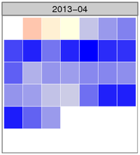
The image shows the normalized temperature anomaly calendar heatmap for April. The bluer the squares are, the colder that day was compared with the 30-year climate normal daily temperature for Fairbanks. There were several days where the temperature was more than three standard deviations colder than the mean anomaly (zero), something that happens very infrequently.
Here are the top ten coldest average April temperatures for the Fairbanks Airport Station.
| Rank | Year | Average temp (°F) | Rank | Year | Average temp (°F) |
|---|---|---|---|---|---|
| 1 | 1924 | 14.8 | 6 | 1972 | 20.8 |
| 2 | 1911 | 17.4 | 7 | 1955 | 21.6 |
| 3 | 2013 | 18.2 | 8 | 1910 | 22.9 |
| 4 | 1927 | 19.5 | 9 | 1948 | 23.2 |
| 5 | 1985 | 20.7 | 10 | 2002 | 23.2 |
The averages come from the Global Historical Climate Network - Daily data set, with some fairly dubious additions to extend the Fairbanks record back before the 1956 start of the current station. Here’s the query to get the historical data:
SELECT rank() OVER (ORDER BY tavg) AS rank,
       year, round(c_to_f(tavg), 1) AS tavg
FROM (
    SELECT year, avg(tavg) AS tavg
    FROM (
        SELECT extract(year from dte) AS year,
               dte, (tmin + tmax) / 2.0 AS tavg
        FROM (
            SELECT dte,
                   sum(CASE WHEN variable = 'TMIN'
                            THEN raw_value * 0.1
                            ELSE 0 END) AS tmin,
                   sum(CASE WHEN variable = 'TMAX'
                            THEN raw_value * 0.1
                            ELSE 0 END) AS tmax
            FROM ghcnd_obs
            WHERE variable IN ('TMIN', 'TMAX')
                  AND station_id = 'USW00026411'
                  AND extract(month from dte) = 4 GROUP BY dte
        ) AS foo
    ) AS bar GROUP BY year
) AS foobie
ORDER BY rank;
And the way I calculated the average temperature for this April. pafg is a text file that includes the data from each day’s National Weather Service Daily Climate Summary. Average daily temperature is in column 9.
$ tail -n 30 pafg | \
  awk 'BEGIN {sum = 0; n = 0}; {n = n + 1; sum += $9} END { print sum / n; }'
18.1667